A Rocking Horse Blaze
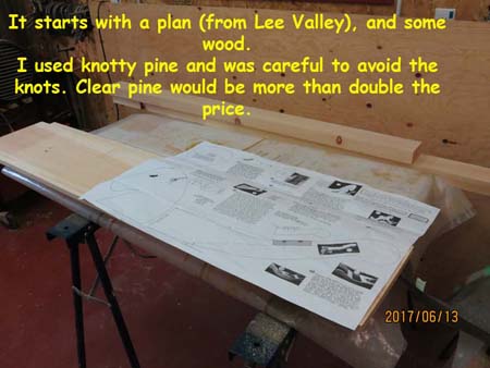
I always wanted to build a rocking horse. It just seemed like a good project to take on, but the right moment never seemed to come along. Either I waited too long, and the child grew up, or I was just too tied up with other projects to take on such a project. Finally a great-nephew happened, and I just had to seize the moment. So I bought a plan from Lee Valley. If you don’t know of this chain of stores then you should google them. They sell all sorts of wonderful woodworking tools, gardening stuff, hardware, kitchen stuff, and unique gifts for the person who has “everything”.
Anyways – they had a plan…..
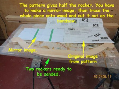
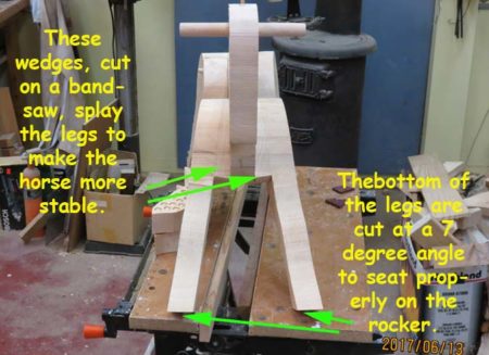
The next step was to transfer the plan drawings to some wood and then cut the pieces using a bandsaw.
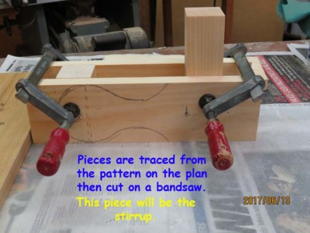

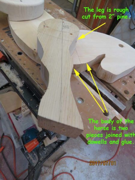
Some special pieces were then cut so that the body of the horse would be stable, especially with a little person on board.
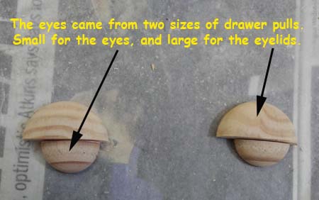
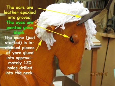
Add some eyes made from wood buttons – again from Lee Valley
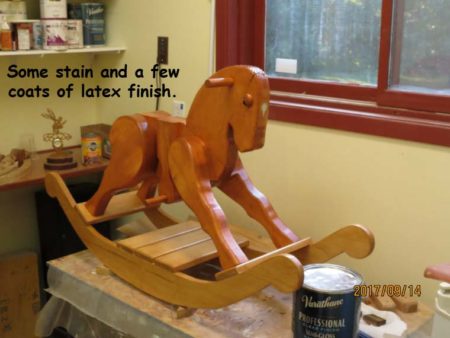
A whole lot of sanding, two colours of stain, and many coats of polyurethane later, it’s starting to look like a proper rocking horse.
A mother-of-pearl blaze was added to the horse’s forehead. Inlay certainly adds panache to many of my projects. It’s definitely not restricted to just musical instruments.
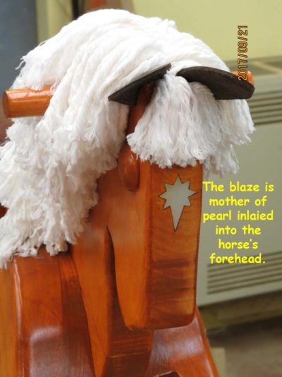
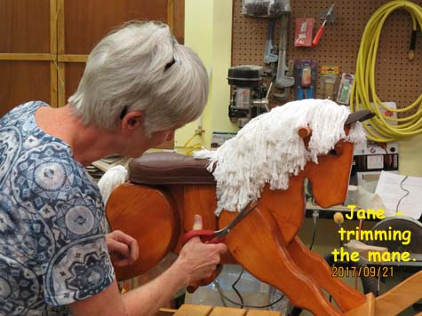
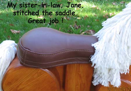
Finally a mane, some ears, and a leather saddle were added. Jane, my sister-in-law did a great job on stitching and fitting the saddle, and helping with the mane. Overall encouragement came from the whole family – by now everyone wanted the great-nephew to like the horse.
The finished rocking Horse:
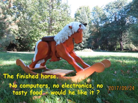
Oh, and yes, the little guy seems to like the horse:
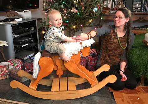
The picture says it all. He seems to know it’s his…..
Special Miniature Urn
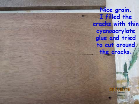
This project didn’t involve inlayed mother of pearl, but was interesting enough to warrant inclusion in this blog. I was asked by two good friends to make a miniature urn out of a piece of wood that had served as a pallet bringing goods from West Africa. When I first saw it, I had no idea what type of wood it was. All I knew was that it was heavy and definitely a hardwood. It was also somewhat cracked and a bit on the dirty side.
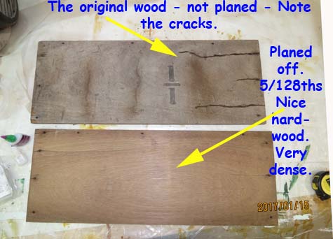
Odum – Cleaned up nicely
Nice grain – very hard
It turns out that the wood is Odum, also known as Oroko wood, from West Africa. This is a hardwood that is used for boatbuilding, furniture, and cabinet work. After working with it, I can tell you that it’s very, very hard on scroll saw blades. Nice wood though.
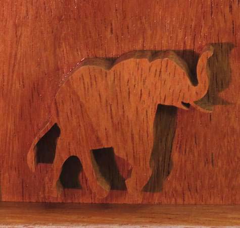
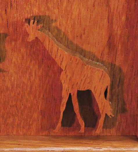
The next step was to get the sizing of the urn and the decoration to be put on it. Our friends didn’t want inlay done. They wanted the wood, which after all, did come from where E’s parents had spent the majority of their lives, to be the main highlight and beauty of the urn. But how to make it apparent that this was about Africa. Not everyone knows that Odum wood is indicative of West Africa. So, I suggested that a scroll-sawn pair of animals from Africa adorn the box, and I started searching the internet for inspiration. I came across this photo and immediately sent it to them for consideration. I love the way the elephant and giraffe seem to be old friends, out for an afternoon stroll.

Nice day, isn’t it?
Our friends liked the choice of animals but wanted them posed differently. The elephant had to have his trunk up, and the giraffe had to be sized to be just about as tall as the elephant. Here’s a picture of the elephant that E. sent me. She’s quite adept at using Photoshop.
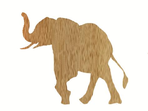
Pattern – Trunk Up !
Our friend’s parents liked a bit of Schnapps before retiring. As well, her mother was known for singing “Show Me The Way To Go Home” so there had to be a bottle of Schnapps at the ends of the urn depicting the head and the feet of the residents. We chose this bottle as a pattern.
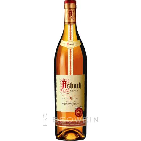
Bottle of schnapps
Finally we had to arrive at a size for the box – I drew this pattern from my head, based on the rough sizes they gave me, and they confirmed the final dimensions.
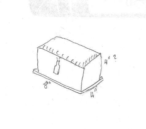
Small box – two interior compartments
So now all I had to do was to make the box. lots of runs through the thickness planer, table saw, band saw and scroll saw later, this is the urn that emerged.
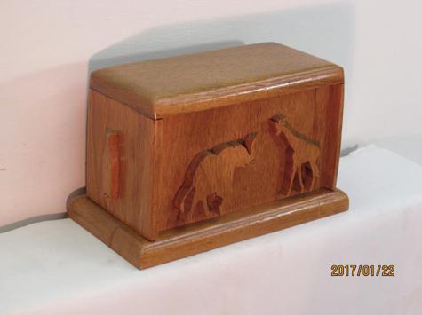
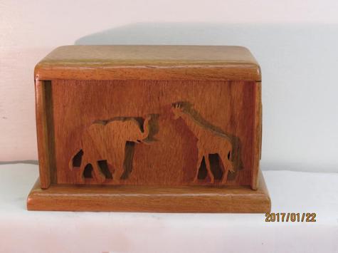
Front of the Urn. Nice colour of wood.
The urn was stained with a water based oak stain and then given many sprayed coats of semi-gloss clear finish. I was really happy with the colour. So were our friends – it now is in a place of honour in their home; a loving tribute to two lovely people.
A Meaningful Sign
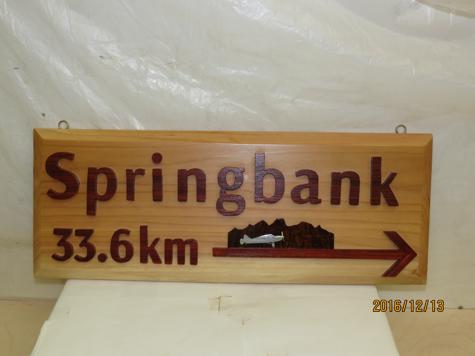
Last Christmas I was searching for a Christmas gift for a brother-in-law. Sometimes I can find a present that I know the recipient will like, but usually I have to really think hard, because generic gifts such as booze just aren’t my thing. Not unless I know that they particularly like a specific brand of spirits or wine. Then my wife came across an ad for a customizable sign. “You can oder it with an arrow pointing to the airport where he keeps his 1947 airplane, and that would put a smile on his face” she said. So I tried ordering it. Everything went well until the ordering software said I had to use miles instead of kilometres for the distance to the airfield. Basically, “No Dice”. So then I had to make the sign. I will also say that making the sign was a whole lot of fun and I really enjoyed doing it.
The sign base is clear cedar. I chose this particular piece because of its fairly straight grain. It’s a nice piece of wood. The raised letters are from some Padauk that I bought some years ago. When scroll-sawing it, a fine red dust appears on my jeans – it’s very red – almost a badge of honour. After a few years Padauk will fade a bit, but when fresh cut, it is almost orange. It’s an easy wood to cut and fun to work with.
A Pleasant Reminder
The mother of pearl plane is cut from a picture of a Bellanca Cruisair that I gleaned from the internet. Note that the landing gear was fairly delicate to cut, especially the tail dragger – delicate until it was inlayed, and the glue had set. Held my breath a lot. The 33.6 km was taken from a Google map, starting at my brother-in-law’s place, with destination of Springbank Airport where he stores his Bellanca. The background (mountain) profile is from an internet photo of a plane taxiing along a runway at Springbank Airport. Unfortunately, the perspective of the photo wasn’t quite what I wanted, but it was at least similar, so I used a little bit of “artistic licence” and it worked. I also figured that the stem of the arrow would make a good runway, and it did. The background wood is rosewood (possible Cocobolo) from a scrap given to me by a friend some years ago.
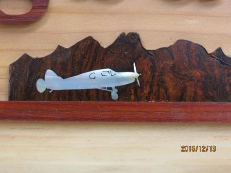
Bellanca Cruiseair – Just about to take off.
I know the photos of my old Chris Craft Constellation (boat) give me a lot of pleasure. Hopefully, this sign gives my brother-in-law similar pleasure – he hung it near the door leading outside, so that it’s always a reminder that his plane is waiting to take him on another adventure.
An Inlayed Wine Rack
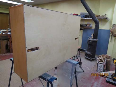
Some friends asked me to make them a wine rack, similar to two other ones that I had helped build several years ago. They have been making their own wine for many years now and when a new batch is ready there’s always the necessity to store the bottles properly on their sides without them rolling off a shelf. A good big wine rack makes a lot of sense. This one is approximately 3′ high X 4′ wide X 1′ deep and can hold about 200 normal size wine bottles.
It presented a few challenges. I wanted to use water based finishes as opposed to oil based, it would have to be lugged down some stairs into the basement, and I wanted to throw in some inlay work, just because I could 😀
So here’s the story.
I was given a very good diagram of what the existing wine racks looked like, complete with dimensions. Good thing, because the original drawings were long gone. From that I worked out the appropriate angles using good old high school trigonometry. Miss Craze (my Trig teacher) would be proud.
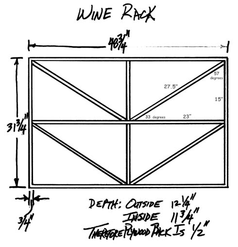
Excellent diagram of existing wine rack.
I won’t bore you with a lot of woodworking details. Instead I’ll concentrate on the three items I mentioned above.
First:
For those that are trying out water based finishes for the first time, the water based finishes that are available at Home Depot clean up very nicely with just soap and water, and aside from the health and environmental benefits, that’s a very nice feature. As well you can get just about any tint you want. With oil based finishes, especially varnish, a very nice golden effect occurs with just a few coats. With water based products the finish dries clear as glass – no golden glow. For many people that’s a drawback. As well, with water based stains it’s important to apply a conditioner to avoid splotches of colour and to minimize raising the grain. You notice I did say “minimize” not “eliminate”. In my experience light sanding is necessary after the first coat of conditioner and in this case I actually applied two coats of the conditioner, and sanded lightly, but thoroughly, between coats, before I was satisfied. Here’s the conditioner I used:
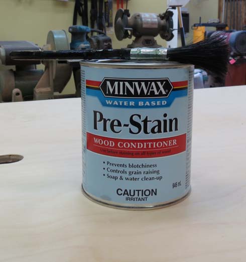
Conditioner is a must.
A word of caution concerning the stain, especially when applying it during the dry winter – It dries VERY quickly. The can says to apply it in small areas, then wipe it off after 3 minutes. After working with it, I say – wipe it off just as soon as you’ve applied it. It becomes difficult to avoid colour swirls, literally after only seconds. So, apply it to about 1 1/2 sq. ft. of wood, then immediately wipe it off – you can always re-apply more if you want a darker shade. If you don’t wipe immediately, the stain will be too dry and the grain won’t show through. Just a warning…. Here are the cans of stain and finish that I used:
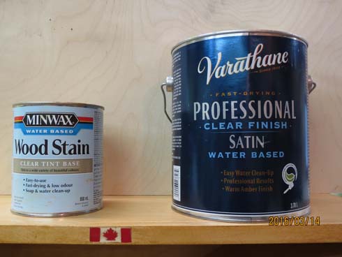
Finish drying time – 2-3 hours
Second:
Lugging a heavy, awkward, piece of furniture up or down stairs is never easy, and it’s worse when there’s nowhere to comfortably grip it. In this case I cut some holes in the back of the rack to allow the fingers to grip the middle shelf of the rack. I also glued a small piece of wood to the bottom of the shelf just so the fingers would have a good smooth gripping surface. The dividers that butt up against it had to be notched to accommodate the little blocks.
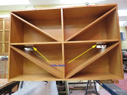
“Comfort” Blocks
Hand Holds
Third:
I thought it would be fun to have a few bits of inlay in the rack. The rack has 1/2″ birch facia on all the front plywood edges and this provided a perfect place for inlaying. I had a small amount of red material that was just the right thickness for inlaying and so some Canadian flags seemed appropriate far a rack containing made-in-Canada wine. My friends have always been appreciative of critters such as squirrels and chipmunks, so a squirrel clutching an acorn, and a howling wolf, made good items for the sides of the rack. I used abalone for the critters because I thought they would stand out nicely against the light brown wood.
Here’s the inlayed items:
And finally, here’s the finished wine rack:
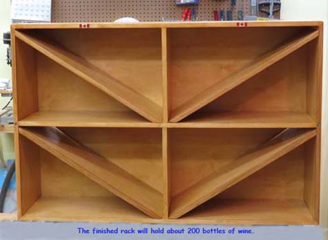
Birch wood wine rack
A Used Breedlove Guitar
My fee for doing the “Tramp” plaque, mentioned in another post on this site, was for Jim to find me a used Breedlove guitar. Jim is a fine, fine guitar player that has an incredible knack for finding good used guitars advertised on Kijiji, the site for selling used items of all descript. It took a little while, but one day Jim contacted me and sent me the ad that he’d found. So I checked it out.
I had already fallen in love with another Breedlove – the neck on them just fits my hand perfectly, and the touch and sound are incredible. This used one was an older “Atlas” model in a “Concert” size, and was certainly in excellent condition. After a short discussion, I bought it. That’s unusual, because I normally like to think about a purchase a bit before deciding, but I really liked this particular guitar. There were no frills: for instance the finish was satin as opposed to gloss, with simple dots in the fingerboard. It was plain. I figured that i’d change that.
Two items would be added – a John Pearce armrest and some Lions in the bridge.
A long time ago I heard about the John Pearce armrest – it’s supposed to keep the arm from touching the top of the guitar, thus avoiding the dampening effect that the upper arm often has on the sound being resonated by the guitar. A side benefit is that it can enhance the comfort level of playing the guitar. Here are some pictures of the armrest:
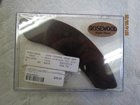
John Pearce Armrest
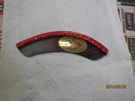
Note hollowed out back . The red tape is covering glue.
Here’s the Lion’s head that I cut from a pearl blank – he’s quite magnificent and very Regal. Note the strong jaw.
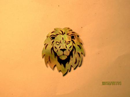
This Lion’s head was a challenge.
Here’s a slideshow of the inlaying process. Click on a picture to start the slideshow, then click on the “Next” & “Prev” at the bottom, to advance or go back. Finally click on any picture to exit the slideshow.
Next I wanted to continue the theme with some more lions on the bridge. I find the manner in which felines move fascinating, so fluid and seemingly effortless, even in the domestic variety. Here are some pictures of the bridge inlay:
Here’s the finished product – I must say I very much enjoy playing this guitar. The touch is great and the sound is just the way I like it. Also, the electronics, while not the most expensive, at least have a built in tuner which I find is very helpful on many occasions. I can’t tell if the armrest has really enhanced the sound – once the armrest has been glued to the top, it might not take kindly to being removed, so a comparison is a bit difficult – however I can say that it’s quite comfortable. No more red ridge on the upper arm from a sharp corner.
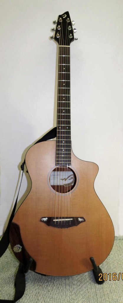
Breedlove “Atlas” Guitar – concert size
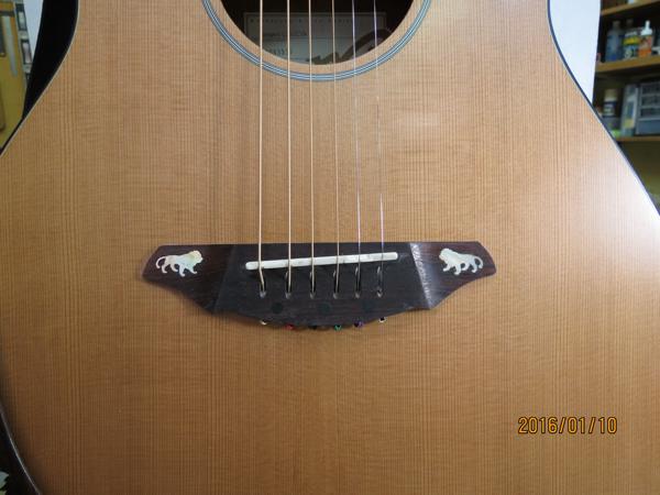
Lions facing each other.
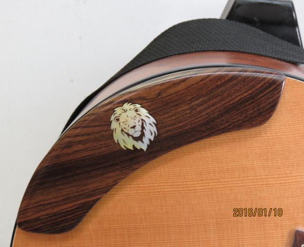
Lion-Armrest
An Amp Plaque
Sometimes things don’t come together quickly – they just sort of stay on a back burner for a while, and then one day a light comes on and finally you’re off and running. That’s sort of what happened with this little project. A friend Jim, had asked me some time ago if I could scrollsaw him a “TRAMP” sign for his amp. Jim’s a fine guitarist and he always manages to get the best sound out of his equipment. Mind you it’s not just the equipment; his playing skills are right up there too.
Anyways, it took a while, but finally one day I started playing around with fonts on my computer and came up with a couple that I thought he’d like. The first was the Cotillion font, which looks quite fancy (some would say flowery), and most of the letters are connected to one another. The second font was the SignPainters-House font, which is a little less fancy and to my mind a lot easier to cut out of pearl.
The connection part is important, because it’s far easier to inly the letters in a straight horizontal. or slanted, line if the letters are connected. Most fonts do not connect any of the letters – they pretty well stand alone. In the case of these two “connected” fonts, the upper case letters, or upper case to lower case letters are not connected, but at least the lower case to lower case letters are.
I realized fairly quickly that I might be able to fit most of the “TRAMP” onto a pearl blank as opposed to having to scrollsaw a set of letters out of thin wood. The “T” would be a separate piece of pearl and the “ramp” could be cut from another, separate piece. So I sent him a word document showing the two fonts, sized as large as I thought feasible for pearl blanks, and asked for his preference. To my relief he chose the SignPainters-House font at a size of 72 points – large.
Here are a few photos of the process. First the pearl “Tramp”:

“Tramp” cut from Pearl – SignPainters-House font.
Next I traced the pearl onto some pieces of rosewood, and practiced routing:
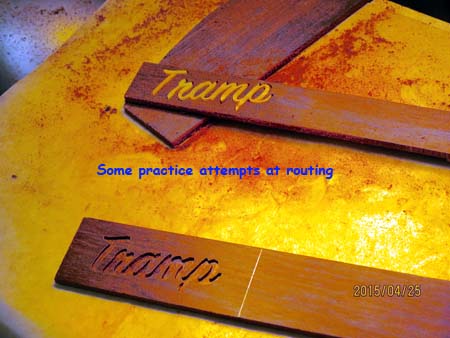
A few practice attempts at routing
Here’s the first attempt at inlaying the pearl.
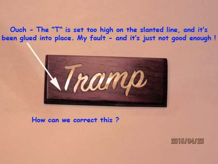
A problem surfaces.
Okay, I goofed, and on top of that I even epoxied the mistake into place. So now I have to fix it. Removing pearl can be done, but constant routing of pearl can cause the router bit to heat up to the point of ruining it. First you have to puncture the pearl in many locations so that the pearl can be removed easily without ruining the edges of the cavity. Not hard, but who knew ? Now you do.
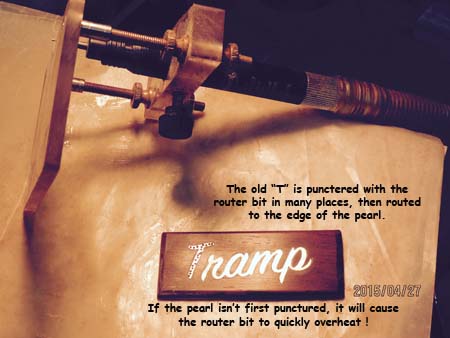
Removing the old “T”.
Next I cut a new “T” with an elongated stem, having carefully measured the required height of the letter. Then I fitted it into the top of the cavity, filing it as necessary until all but the elongated portion slotted into place. Then I traced the elongated portion onto the wood and routed out the additional space. When it all fit nicely, I re-epoxied the letter into the wood, and did the finish sanding and polishing. Here’s the finished plaque:
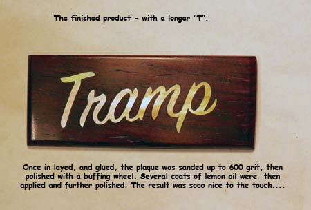
Finished Plaque
Once I’d finished the plaque I notified Jim that it was ready. Jim, who lives some distance away, said he’d pick it up when he came down for our once a month gig. To be honest, the little plaque felt so good in my fingers that I really didn’t want to part with it – it was very pleasant to hold and touch with my fingers; smooth enough to be almost slippery. But finally he did visit, and took it back with him to attach to the amplifier that it was intended to enhance. Here’s a picture of it siliconed onto the speaker grill of one of his amplifiers.
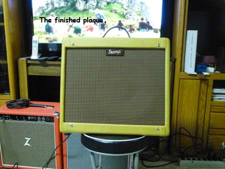
The plaque – siliconed onto the speaker grill
A Signature Guitar
In the early 2000’s I started going to John’s Barber shop in Kemptville, Ontario. I remembered at the time that there was an album from somewhere in the seventies called “Don’s Barber Shop” that featured Ralph Carleson & Country Mile. Lo and behold – there in the barber shop was Don O’Neil who was the inspiration for that title song. Don even cut my hair. Kool. Over the following years Don has become a friend and a supporter of my inlaying endeavours. We chatted about a number of things and at one point he mentioned a guitar that he had purchased that he would like inlayed. He wanted to be able to pass it on to someone in his family and we eventually settled on inlaying the headstock with his family name.
It’s an interesting guitar. The original owners had built a Martin kit guitar and had taken it to several festivals, where they had asked the performers to sign the top of the guitar with a ballpoint pen (I think). The ink has since faded away, but the indentations are still there. Below are photographs of most of the signatures – Ricky Scaggs is one of them !
 Ricky Scagg's signature
 "Skagg's" is highlighted
 jimmy landreau's signature
 Bela F*** ???
 Mike ???
 Norman Wright
 Ray Adams Signature
 Jim Shely ???
Here’s a shot of the Original Headstock:
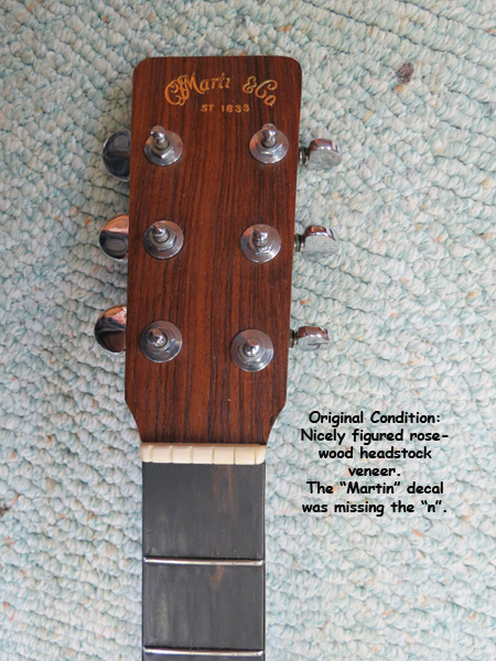
Original Headstock
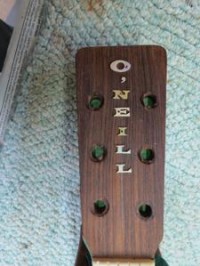
To get started I typed O’NEILL in a number of different fonts and sizes and showed them to Don. He picked a Wide Latin font, which was not my first choice, but Don was sure that’s what he wanted, and in retrospect I think his choice was better than mine. We agreed that the sizes would be from 36 points down to 26 points to best fit the shape of the headstock.
Next I cut the letters from both Abalone and Mother of Pearl to see which shell would best suit the rosewood. Which one would you have chosen ?
Abalone
Mother of Pearl
I’ll admit that the photo showing the abalone isn’t all that clear, but even so, the letters just don’t sparkle. In general abalone is often muted in comparison to MoP. Don chose the Mother of Pearl.
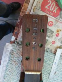
The next steps were to route the letters in the guitar headstock, glue in the pearl letters with epoxy glue, sand off the excess glue and apply many coats of nitro cellulose lacquer.
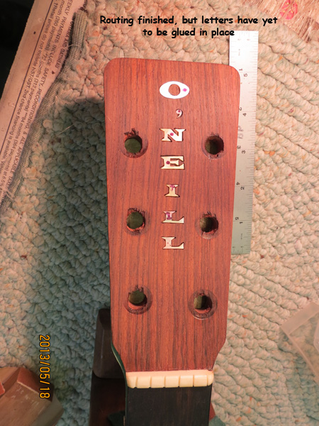
Routing completed.
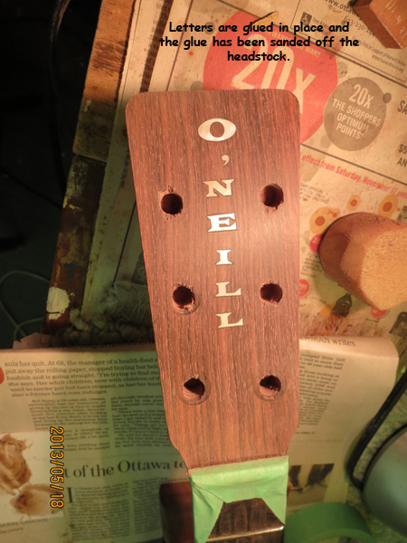
Letters glued in place and sanded.
Applying the lacquer is where I ran into trouble. The spray bombs that I was using put out insufficient spray for the job, and resulted in a very, very thin coat of lacquer. As well, the headstock wasn’t completely flat, so when I finish sanded the headstock in preparation for buffing, the center was untouched but the sides were wreaked. Ouch !
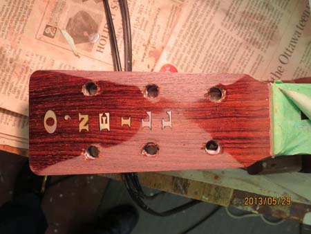
Insufficient spray even for minimal sanding
So I telephoned my friend and top notch luthier, Jim Spooner, who has kindly offered help and advice many times. Jim immediately diagnosed the problem as insufficient spray and set about righting things using a proper spray gun in a spray booth. The finished product looked a lot better.
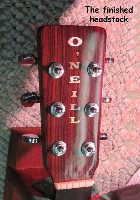
Turned out nicely after some magic from Jim Spooner.
Don was quite pleased with what is now an O’Neill family heirloom.
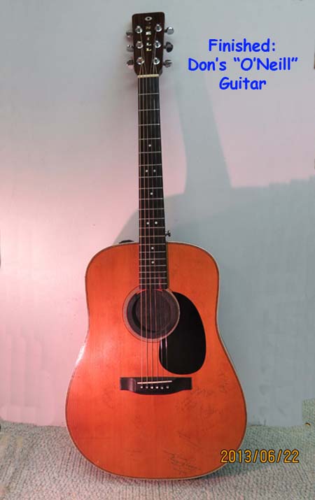
Good sounding guitar and now it’s special to the O’Neill family
A Baritone Ukulele
Here is a Baritone ukulele that I’ve recently completed. It started out as an idea for a different sound, and truth be told, one of the main attractions was that it would be relatively easy to learn how to play. That is – I could transfer my guitar playing skills (such as they are) to playing the baritone ukulele without having to learn a whole new set of chords.
At the same time I wanted to wind up with something “special”, hence I would practice my inlaying skills and create something fairly unique. So I bought a fairly nice ukulele that already had “prettiness” built in. It’s an Oscar Schmidt OU55CE baritone ukulele, and had a good touch right from the start. It also sounds good, either just by itself or plugged into an amplifier. My contribution to the “prettiness” was the inlaying of the fretboard and the bridge. I’m also in the middle of doing a series of mini articles that describe the process of inlaying the neck and bridge. You’re welcome to visit them by clicking on “Guitars and Such” at the top of the page, then on “My Baritone Ukulele”. A series of articles will then appear entitled Step 1, 2, 3 etc.
For now here’s a couple of photographs of the completed ukulele:

The finished Uke

The Ukulele Lady

A Seahorse adorns the Bridge
Extended family – some gifts long overdue
Some friendships were made to last, and this friendship has lasted for over forty years. In this case, it’s a multiple friendship. We met when we were all single, went to a lot of parties as couples, got married during the same year, and stayed friends through moves, a birth, job changes, and lately retirements. We think of each other as extended family.
The concept in my mind was to build two boxes; one for her, and one for him. The first step is to find themes and images that will mean something to the recipients of the gifts. For her, loons have always been a cherished bird, and for him, the dream is to be outdoors in the woods. So the themes would be outdoorsey – a loon theme for her, and woods and water for him. While I was building the boxes I thought it would be a good opportunity to take some photographs of the “build” and then annotate them to give a picture history of the boxes coming together, complete with the various challenges that happened along the way.
Here’s one of the finished loons.
 - r small")
One of the finished loons
The internet is usually where I start. I begin by finding a picture or drawing that is suitable for converting into a pattern, then modifying it down to something that’s simple enough for me to cut out of pearl and abalone, and finally sizing it to fit the blanks of pearl on hand.
So below, please find below a series of slideshows that depict each step of the process. As usual, click on a picture to view the slideshow, then click on the arrows at the bottom right and left to advance or go back. Finally click again on any photo to exit the slideshow.
First the pattern – Enjoy the pictures.
 This picture gave me a fairly simple outline.
 A more complex picture.
 Photoshopping fun
 Sectioning the photo into pieces for cutting.
 Multiple images.
The next step is to cut the patterns and glue them onto pearl or abalone. Here’s some photo’s of that process:
 The workbench
 Cavities routed
 Pearl and Abalone
 The side & router
 The loons in cavities
 The top
 The 10 piece loon
Now the box is glued together
 22 of 26 pieces
 Gluing the cleats
 The box in a gluing jig
 The jig from another angle
 Sanding the corners
In applying a nice gloss finish, a problem arises – dreaded dust. Someday I’d like to set up a dust free drying room, but unfortunately at this time I don’t have a dust free shop. It’s easier said than done to eliminate dust. Here are the pictures:
 Various grades of sandpaper
 Ready for a finish
 Some jogs to hold the pieces
 Inbetween coats
 Lots of gloss
 Nice Loon
 Dust problems with gloss finish
Finally – here are pictures of the finished boxes. I applied a satin finish to the exterior to mitigate the dust problem. I also “flocked” the interior, which results in a velvet like surface. It’s quite nice and easy to do.
 Howling Wolf
 A compass and some flocking
 Green flocking
 A loon scene
 More loons
 The 10 piece loon
 The box top with initials
Personalizing a guitar
In the fall of 2011 I was at a friend’s house for a visit, and was shown a guitar that the daughter had not played in a while. To be blunt, it was no wonder that she found it difficult to play; the strings were so high off the fretboard that they wobbled from side to side when pressed onto a fret !
And although the guitar itself might have sounded good at one time, the strings were probably the originals, and had absolutely no life left in them.
The guitar needed some TLC.
I also figured that a little bit of inlay would go a long way to making it “special” and as such a bit more inviting to the player. So, I took the guitar home with the intention of putting on some new strings and improving the touch a bit, and hopefully inlaying some items that would make the guitar special to the daughter.
First things first – the touch was improved by lowering the saddle over which the strings are stretched, so that the strings are situated closer to the bridge.
")
The neck’s truss rod was also tweaked a bit to avoid string buzzing.
")
")
Adjustor location
The next step was to come up with a theme that the daughter would like – something that would invoke some good memories. Her father came up with the idea of using some images from her time spent as a summer student in the Fort Henry Guards. Fort Henry is open to the public to tour, and is located in Kingston, Ontario, Canada.
He sent me a photo of a sweatshirt that had the Fort Henry Guards emblem on it. We also got some pictures of the special hats they wear, and the Armstrong cannon that she fired to mark noon hour. For good measure I also added some Maple Leaves to mark some of the frets.
The FHG emblem was the hardest to cut because it involved several closely spaced parallel cuts that just invite the pearl to break where it joins the main body of the emblem.
")
Sweatshirt image
")
Emblem cut from pearl
Here are some of the other pieces that were cut:
")
")
Below is a slide show of the finished guitar – just click on any of the thumbnails, and then scroll through the pictures by clicking on the arrows at the bottom of the pictures. Stop the slideshow by clicking on any of the images.
 The finished guitar
 The initials really flash in the right light
 FHG stands for Fort Henery Guards
 These are "Armstrong" canons
 The fretboard is much prettier than the original
 A FHG hat
My hope is that by having a guitar that’s easy to play (i.e. absence of bleeding fingertips) and special to the player, the daughter will be inspired to take up music again and learn the joys that music can bring to the individual. It’s a very nice feeling to be able to share a love of music.